


LEARNING TO SEE Cover Revealed!
The iterations of the creative process and the final design

In my last post, I gave you the cover design parameters that the designer had to follow for the cover for Learning to See. Did you come up with any cover ideas? If not, pause for a second, and envision a possible cover for a book called Learning to See: Inside the World’s Leading Art and Design Schools.
If you like, you can jump to the end to see THE FINAL COVER! But that would be a spoiler for the creative story; it’s a better story if you don’t know the end at the beginning. In this post, I’ll share with you the design process that led to the final design. This creative process is exactly what I describe in Learning to See. This story is a real-world example of how professional design happens. Below, you’ll see the various cover designs that our designer Emily Gutheinz came up with, the iterations, and the collaborative input of many, many authors and editors. The final cover design is at the end, so you can skip ahead if you just can’t wait to see the final cover! But it’s a more compelling story if you see the early drafts first.
Step 1: The nine images that Emily generated in the first step
Emily first generated nine cover ideas. The goal, at this step, is to go for range: to create images that are very different from each other. Here are the nine:
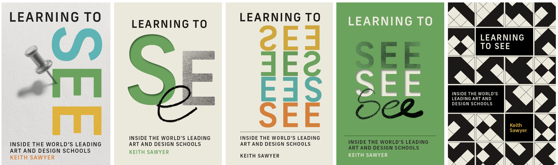
Which would you pick?
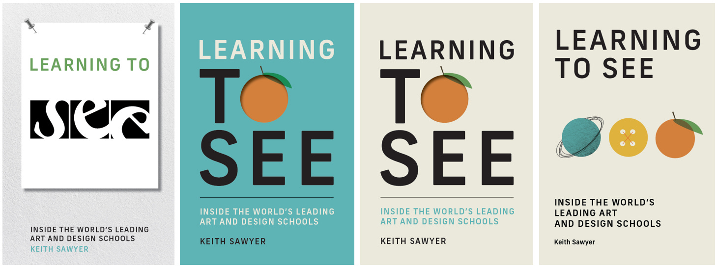
Step 2: The top four images
The senior leadership at MIT Press narrowed down this set to four that they thought would work the best:
This team included editorial and marketing. Typically, editorial is concerned that the cover fairly represents the content of the book, and marketing wants the cover to appeal to the broadest possible readership, but in particular, the core target reader. At MIT Press, their policy is to give the author the final say. So I could pick any one of these four and that would become the cover. Starting from the left, I liked first and second the best, but I wasn’t sure which. I was leaning towards the black and white design—the second from the left. I’m a sucker for geometric shapes. So I sent these two to everyone in my author group—about 40 seasoned, successful book authors and editors. Twenty replied and it was unanimous: No one liked the design I had picked! They thought it looked too much like a textbook. Instead, they chose the first one. Another strike against the black and white cover is that it’s hard to read when it’s a postage stamp on Amazon. I believe in the genius of the group, so I turned away from my choice and I went with the leftmost cover, the one with the backwards “SEEs”.
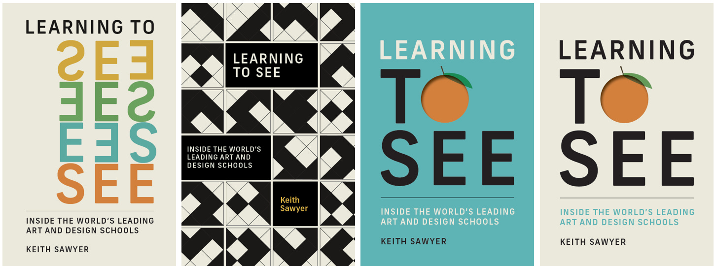
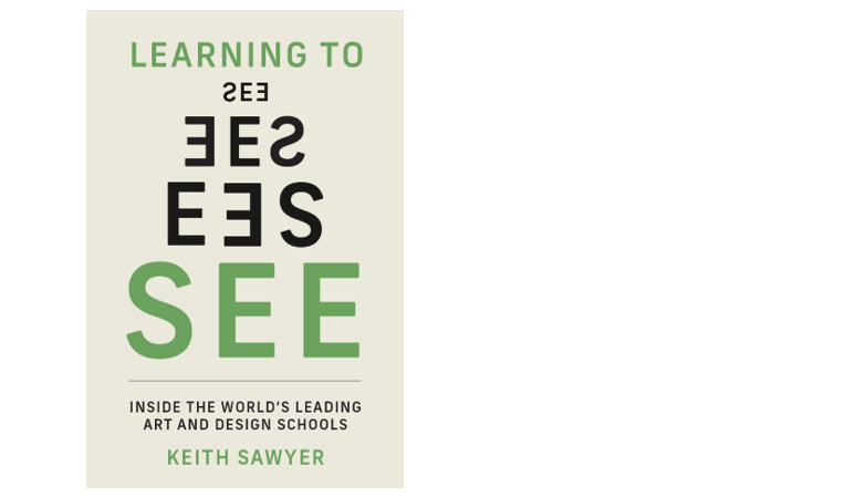
Step 3: Additional variations on the selected design
Here, again, is the design that everyone thought had the most potential:
But no one thought it was perfect as is, mostly because it was kind of hard to read. You have to think a minute to figure out that the last word is “SEE.” I got a lot of useful suggestions from my author colleagues about how to address this. I passed those suggestions on to Emily. In the next step, she generated another set of variations, responding to each suggestion.
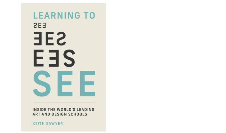
The first suggestion was to make the words start small at the top and get bigger, like the vision test you get at the optometrist. Here’s what Emily did:
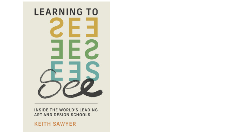
That was pretty good! Another suggestion was to highlight the final “SEE” by making it an illustration. Here’s Emily’s version:
A couple of people suggested changing the thickness of the letters, and here’s Emily’s version:
Again, this one is good because the word “SEE” pops out more. I’m really impressed with Emily’s expertise in working through this iterative creative process!
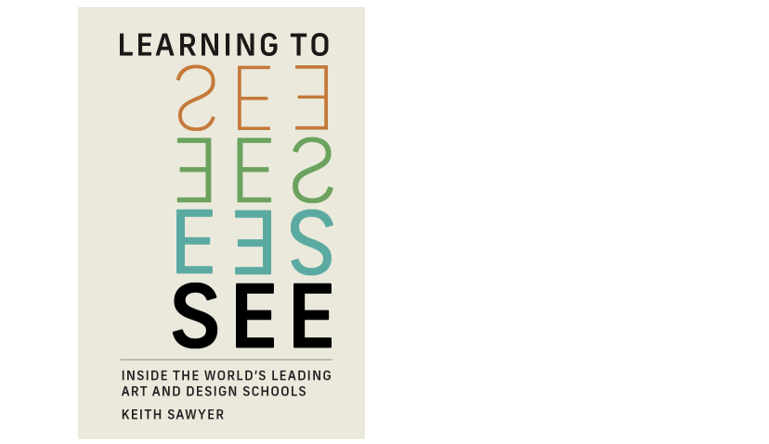
Here’s the fourth one that Emily did—a combination of several suggestions:
I shared all four with my author group, but this time, all four of the designs got at least one vote! I got to make the final choice, and I chose the fourth one. But I preferred the green color of the first design, the “optometrist chart.” I thought that this blue was too faded and that it would be hard to see in postage stamp size. I also liked that the author name was bigger on the first one. (Don’t hate me! An editor I know also thought the author name was too small.) I asked Emily to make these two final modifications.
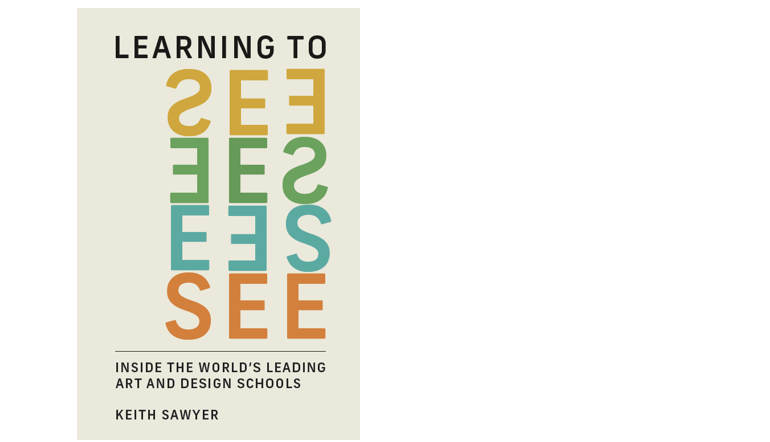
Drum roll please! The cover is revealed!
Here it is!
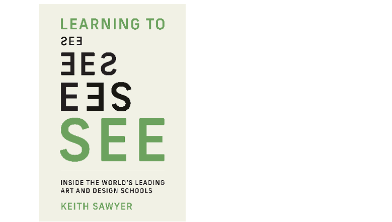
It’s beautiful, isn’t it?
The design process
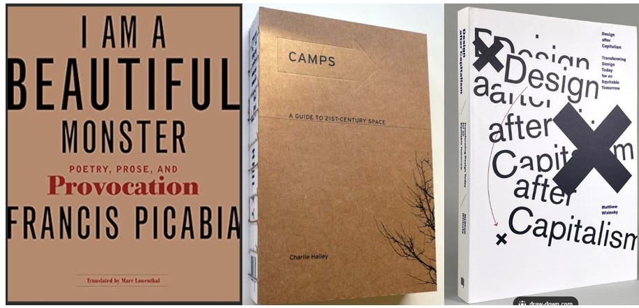
My editor at MIT Press, Phil Laughlin, told me at the beginning that I could pick any of the first four and they’d go with it. But I believe in the design process and I believe in group genius. I knew that Emily was a seasoned pro and she would come up with great stuff. She’s won tons of awards; here are some of her other covers:
The cover design process echoes the creative process I describe in Learning to See: lots of ideas up front; iterative revisions; input from a variety of disciplines and experts; all guided by constraints that had to be met, including accurately representing the content and being interesting to potential buyers.
LEARNING TO SEE is now available for pre-order
Learning to See is now available for pre-order on Amazon and at Penguin Random House, with a 20 percent discount if you use this order code: READMIT20.
The publication date is April 22, 2025! Stay tuned for more updates!
I loved this post about the development of the Learning to See cover! It’s wonderful to get a behind-the-scenes glimpse of this part of the process. Thanks for sharing it and making the creative decisions so visible. Can’t wait for the book!
All of this is fascinating! Thank you for sharing about the design process. I look forward to, er, seeing your new book!
Have you watched the documentary series about Saturday Night Live that is on Peacock? I thought of you when I watched it. I suspect you would be particularly interested in the third episode -- "Written by: A Week Inside the Writers Room." It's a great documentary about a structured group creative process. Perhaps a subject for an article!